27 October 2018

The fascinating history of ink and communication


People often ask me about my business name, ‘Maybury Ink’. Well the ‘Maybury’ part is easy – it’s my surname, and it’s fairly uncommon, so I used it hoping it would be memorable rather than difficult to recall! And the ‘Ink’ isn’t to sound like a tattoo studio (well mostly – I am quite fond of body art), it’s because ink completely transformed the way we communicate. And that’s what I aim to help businesses do – transform their communication, both visually and in words.

The history of ink is fascinating. Our history is written in ink. Literally. Using ink we have recorded events, knowledge and stories for thousands of years.

Ink was first used to for artistic purposes some 40,000 years ago. It decorated cave walls, animal skins and bodies. That’s a long history of visual communication.

Writing emerged around 3200 BCE. However, it took until 2500 BCE for ink to be used for writing in both Egypt and China, coinciding with the development of the first paper, papyrus (made from the water plant), followed by parchment (made from animal skin). Inks were made using various concoctions of blood, ochre, sap and resins, soot, oil, beeswax and vinegar.

For thousands of years all writing was done by hand, with woodblock printing being used significantly from the 2nd century in China. Both methods were labour intensive, and thus expensive. So written works were not widespread, nor was literacy.

Moveable type (single blocks for each character) was invented in China in the 2nd century but wasn’t widely used until the 12th century, and it took until the 15th century to reach Europe. There it culminated in the mechanical printing press developed by Gutenberg, and the development of oil-based inks containing carbon, copper, lead and titanium. The printing press made mass production of books possible, and thus began the industrial era of printing.

With the written word more widespread than ever before, literacy increased across Europe (and interestingly this is what led to the standardisation of spelling). However, printing was still in the hands of an elite few until the advent of the typewriter in the 1860s. This led to a further development in ink, with most typewriters using an ink-soaked ribbon. The typewriter transformed business communication in efficiency, presentation and professionalism.

By the 20th century books and newspapers were widely available and accessible. It was during this time that office machinery significantly progressed and business communication reached a new level. The photocopier was commercialised in the late 1950s, and then computerised printing with laser and dot matrix printers in the 1970s and inkjet printers in the 1980s.

Today, most of our homes have printers (the machines can cost less than the ink refills we use in them!). Newspaper print circulations have declined. Many books are printed on demand. Or they aren’t even printed – they’re listened to or read on a screen (some using electronic ink!).

In our businesses we are printing less in our offices, and less for our marketing and communication activities due to the rise of digital marketing channels. But while the use of ink has declined, the level and importance of communication continues to grow and transform.

If you'd like some help to transform your business communication, please get in touch, or visit my website for details about what I do.

30 July 2018

A quick guide to colour psychology and branding


Colours impact our emotions and perceptions. These impacts need to be considered when choosing brand colours.

I'm designing a logo and visual identity for a client's newly acquired vehicle transport company, and in the midst of researching logos in the marketplace. As happens in many business categories, there are some dominant colours used – dark blue, dark grey and black, with splashes of red, orange and yellow. It makes sense that transport companies would use the darker, cooler colours to be perceived as serious, stable and reliable; and the brighter, vibrant colours to show they are energetic and confident.

Colour is the number one component of your brand that people remember. So you need to choose wisely, not only for a positive emotional response and to represent your brand personality, but to stand out in the clutter.

Colour meanings

By understanding the psychology and symbolism of colours you can harness the power of colour in your branding. Below is a summary of common colour meanings and associations for Western culture. In other cultures colour meaning can be very different, so if you’re an international brand you need to consider this.

Red 

Red is the colour of blood and fire. Red is assertive, daring, energetic and exciting. It symbolises action and confidence.

It is also associated with danger and anger.

Brown 

Brown is earthy, natural, organic and wholesome. It symbolises the outdoors, stability and tradition. Brown indicates being approachable and genuine.

Negatively it can be seen as dogmatic and dirty.

Green 

Green is the colour of nature and the environment. It is associated with freshness, healing, harmony, peace, stability and fertility. It also symbolises safety and ‘go’, as well as finance and wealth.

Negatively it is associated with envy, jealousy and guilt.

Yellow 

Yellow is the colour of sunshine. It communicates joy, happiness, optimism, hope, friendliness and energy. It can be associated with intellect, enlightenment and mental clarity, as well as safety.

Negatively it can be mean irresponsible, unstable and hazardous.

Orange 

Orange is fun, friendly and flamboyant. It is associated with warmth, energy, activity, youthfulness, creativity, courage, adventure, freedom and determination.

Orange is a colour people have strong 'love' or 'hate' opinions about.

Pink 

Pink is stereotypically associated with females. It represents compassion, and is playful and cute. It’s also a diverse colour, as bright and pale pinks evoke different emotions.

Bright pink is energetic (similar to red) as well as youthful, fun and exciting. Pale pink is sensual, light-hearted and positive. It is associated with love, romance, tenderness and sweetness.

Negative associations include weakness and immaturity.

Grey 

Grey can symbolise formality, sophistication, conservatism, security, reliability and intelligence. It can be perceived as long-lasting, classic and sleek.

It is also associated with being dull, dingy, gloomy and sad.

Blue 

Blue is versatile, and is the most universally favoured colour. It is the colour of the sky and sea and is often associated with depth, stability and tranquillity. It symbolises trust, loyalty, cleanliness, wisdom, confidence, intelligence, integrity and truth.

Not all blues are serene and sedate. Electric or brilliant blues are dynamic, dramatic and exhilarating.

Negative associations include sadness, depression (feeling ‘blue’), coldness and fear.

White 

White is associated with goodness, innocence, purity and cleanliness. It represents simplicity, perfection and freshness. It has a modern, minimalist quality.

Negatively it can be stark and sterile and associated with isolation and emptiness.

Black 

Black is bold, serious, dramatic, elegant and mysterious. It is associated with protection, formality, authority, luxury and sophistication.

It is also associated with death, mourning, fear and evil.

Purple 

Traditionally associated with royalty and nobility, purple still connotes luxury, dignity, ambition and grandeur. It also has a spiritual, mysterious quality and can represent peace, creativity and magic.

Darker shades of purple are more associated with extravagance and opulence while lighter lavender shades are feminine, sentimental and nostalgic.

The symbolism of mystery may be a negative, depending on your brand, along with its association with moodiness.

And my client? 

So what colour direction is my vehicle transport client headed? We're looking at using a bold colour – hot pink or bright aqua – combined with black to make it pop. Something that's eye-catching, different to key competitors, and that says 'dynamic'. We'll certainly be harnessing the full power of colour for this brand identity.

05 June 2018

All logos are not created equal


At the heart of a strong business brand is an identifiable logo. Developing a logo requires creativity, research, thought and considerable work. It’s not something that should be thrown together ad-hoc. You can get a cheap logo through websites such as Fiverr, and I recently saw an offer in a Facebook business group for a logo, business card design and 250 printed business cards for $299. But as with most things, you get what you pay for.

And what you should get is a customised logo that effectively represents and differentiates your unique business, and appeals to your customers – not leftover concepts from someone else’s brief, or a rip-off of another logo.

A design professional will take the time to understand what your business does, your vision, values and personality, and who your customers are. They will spend time discussing your design ideas and preferences (and they may not agree with them and they will tell you why!). They will research your business category, competitors and symbols. They will explore and test ideas and concepts, and present you with multiple logo concepts to work from.

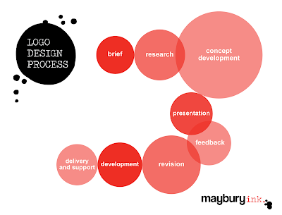
I thought it would be helpful to take you through the logo design process so you can understand the value of engaging a professional graphic designer:

  • Brief: The designer will take a detailed brief about your business – vision, values, personality, products and services, and customers. They will want to know about any design ideas and preferences you may have, dislikes and so forth. They will draw out all the information they can to determine what attributes they will turn into a visual representation of your business. They will take lots of notes!
  • Research: The next step involves researching the marketplace, competitors, businesses with similar personalities in other categories, as well as relevant symbols and icons. This research will help ensure your brand is differentiated and unique.
  • Concept development: Alongside the research, ideas will be noted and sketched. There will be brainstorming, experimenting and then filtering and refinement of concepts until the strongest designs emerge.
  • Presentation: Once the initial concepts are developed the designer should present at least two, but ideally three distinctly different logo concepts (not just different colours or slightly varied logos – that’s later in the process).
  • Feedback: The designer will be interested in your initial feedback, along with your thoughts as you contemplate the designs over a few days.
  • Revision: Your feedback will be incorporated into revised designs and updated concepts will be presented. Then there’s more feedback and further revision of the concepts – this may loop through two or three times.
  • Development: Once you’ve decided on a concept, the final logos will be developed – perhaps in vertical and horizontal versions, to work as a single colour and in reverse; as well as versions for social media icons. Logos should be created in various colour formats (PMS, CMYK, RGB) and in various file formats (eps, png, jpeg).
    Many clients also engage their designer to develop the visual identity that will accompany the logo, including colour palette, typography, graphic style and imagery. This would be refined at this stage and designs developed for stationery and marketing collateral.
  • Delivery and support: You will receive your logos, and ideally a design style guide that outlines correct logo use and specifies colours, typefaces and more. A good designer will be able to help you roll out your new logo design, and be able to provide future services to build your visual brand identity.

As you can see, it’s quite a process! Although there are cheaper logo design options out there, they really don’t compare to the value you get from investing in an experienced graphic design professional. Remember, all logos are not created equal.

If you're looking to develop a new logo, or evolve an existing one and want to chat, please get in touch with me.

27 February 2018

Capital offence: the rules for using capital letters

Using capital letters correctly will improve the professionalism of your business writing.

Capital letters are often overused and used inconsistently. Other than looking unprofessional, incorrect capitalisation can decrease readability, which impacts communication and engagement. This overview will help you avoid committing any capital offences!

Always capitalise …

There are two fundamental rules about what to capitalise: 
  1. Sentences should always begin with a capital letter.
  2. Initial capitals should be used for proper nouns – the names of places, people and organisations.

Some examples

  • Buildings and public places, e.g. Bourke Street Mall, Melbourne Town Hall
  • Holidays and events, e.g. Labour Day, Small Business Festival Victoria
  • Organisation and business names, e.g. Moreland Energy Foundation, Gauge Espresso
  • Trademarks, brand and product names, e.g. Aeroplane Jelly, Beechworth Pale Ale
  • Titles, e.g. Ms, Dr, Minister
  • Legislation (also italicised), e.g. Copyright Act 1968
  • Journals, newspapers and magazines (also italicised), e.g. The Age, Journal of Marketing Communications

Rarely capitalise ... 

Articles, prepositions and conjuctions (such as ‘a’, ‘and’, 'in', 'of' ‘or’, 'the') are only capitalised at the beginning of sentences, headings or titles. For example, 'the' is capitalised in newspaper title The Australian, but 'of' is not capitalised in National Gallery of Victoria.

Exceptions

Sometimes the normal rules of capitalisation are broken for stylistic reasons. A brand or product name may not have an initial capital, such as the iconic iPhone. Or capitals may be abandoned altogether, as is the preference of singer k.d. lang.

You choose ...

Further to these rules, you have a choice of capitalisation style for things like headings and book titles. Traditionally maximal capitalisation was the norm. Modern, minimalist style means limited capitalisation is now common.

In my opinion, minimal capitalisation looks cleaner and is more readable. However, if you prefer maximal capitalisation, then use it! The key is to be consistent with the style you choose. Ensure your preferred capitalisation style is added to your business’s writing style guide.

Examples using minimal capitalisation

  • General titles and headings, e.g. What is content marketing?
  • Book titles, periodicals, articles, web documents (also italicised), e.g. The vanishing act of Esme Lennox, All marketers are liars
  • Song titles (also in quotation marks), e.g. ‘Dazed and confused’, ‘Boots of Spanish leather’
  • Movies, television and radio programs, podcasts, e.g. Upper middle bogan, The bridge on the River Kwai

Examples using maximal capitalisation

  • General titles and headings, e.g. What is Content Marketing?
  • Book titles, periodicals, articles, web documents (also italicised), e.g. The Vanishing Act of Esme Lennox, All Marketers are Liars
  • Song titles (also in quotation marks), e.g. ‘Dazed and Confused’, ‘Boots of Spanish Leather’
  • Movies, television and radio programs, podcasts, e.g. Upper Middle Bogan, The Bridge on the River Kwai

FULLY CAPITALISED HEADINGS

When formatting documents with multiple heading hierarchies, I would suggest ALL CAPS be used sparingly. This style may be required to differentiate between hierarchies, but be aware that readability is compromised when lengthy headings are formatted using all capitals. For shorter headings this isn’t such an issue.

More ...

For more grammar tips, see my blog posts on writing time and using dashes correctly.

If you need someone to finesse your business writing or you want a writing style guide developed for your business, get in touch with me!

15 November 2017

Brand impacts: poor grammar and spelling in social media

I am surprised and dismayed at how regularly I see poor grammar, spelling mistakes and typos in business social media posts. And not just one-off errors, but multiple mistakes.


The importance of correct grammar and quality writing in all business communication cannot be overstated. It’s crucial in presenting your business as professional and trustworthy. When business writing is poor, it can quickly negatively impact your reputation. And that’s not how you want to differentiate your brand.

Making an occasional error in business social media posts is forgivable, and shows we are human. You might argue that it adds authenticity! Even those of us who are fussy about spelling and grammar make mistakes. (If you do notice an error in your post, edit and fix it immediately.)

A Facebook post by a small business offering sales training services prompted me to write this. In the post they had used ‘too’ instead of ‘to’, ‘their’ instead of ‘there’, and ‘weeks’ without an apostrophe when one was needed. And being extra picky, I’d point out the irregular use of double spaces (these are a hangover from typewriter days and unnecessary in modern typography – they are jarring and break the flow of reading). As well as using too many dots in ellipses (which consist of three full stops … with a space either side).

These errors may seem trivial, and some people wouldn’t notice them or care, however, those of us who are particular about such things (and there are many of us) would be left with a negative association with that brand. It made me question the quality and professionalism of the sales training the company would offer.

If you’re not good with spelling and grammar and want to avoid damaging your brand asset, here are a few tips:

  • Review your post before publishing it, and check anything you’re uncertain of.
  • Educate yourself on the common mistakes you make and develop a cheatsheet you can refer to.
  • Write your posts in Word and use the spelling and grammar check (however, this is not foolproof).
  • Get a colleague who is a spelling and grammar whiz to check your writing.
  •  Invest in a professional writer/editor.
By improving the writing and grammar in your social media, you will protect your brand. It’s one of those things that no one notices you’re doing well, but it certainly gets noticed when you’re not. And it can impact your bottom-line.

15 October 2017

Have you defined your brand personality?

Brand personality Maybury Ink.

Brand personality is attributing human characteristics to a brand.

Having a defined brand personality differentiates your business brand from other brands and helps you to stand out and break through the clutter. It will guide the way you express and portray your brand (how your brand speaks, behaves and looks), and ensure your brand is represented consistently. It will help the right people to connect with your brand, and increase brand awareness.

If your business doesn’t have a defined brand personality, it’s worth determining one. (And then reviewing your brand alignment and strategy against it!)

There are various brand personality models, however, I think for small businesses it’s satisfactory to select a set of keywords to describe the essence of your business personality. Three (max. four) are enough.

For example, an organic produce company might define its brand personality as honest, friendly and principled.

A high-end hair salon could describe its brand personality as glamorous, exclusive and professional.

You can use the extensive (but not exhaustive) list of keywords above to help define your business’s brand personality. Or use a thesaurus to help you come up with the right words. Nuances are important – happy, cheerful and exuberant mean similar things, but each word gives a different feeling (this is also important for your brand language and writing).

Once you have a brand personality defined, your visual identity and brand language and voice will flow from this. And you can get your branding on target.

07 September 2017

Innovation and adaptability: Small Business BIG Ideas 2017

gus-balbontin-disruption-maybury-ink-communication-branding
Innovation and adaptability were key themes from the inspiring keynote speakers at the Small Business BIG Ideas event held on 4 September, as part of the Small Business Festival Victoria. I’d recommend learning more from these great speakers:
  • Gus Balbontin, Investor | Founder | Advisor
  • Dr Amantha Imber, Founder and CEO of Inventium

I jotted some notes to share.

Gus discussed disruption and business transformation.

  • It is not the strongest of the species that survives, nor the most intelligent. It is the one that is the most adaptable to change.
  • Adaptability in business is critical, with the rate of change getting faster and faster. (See the great slide above on disruption.)
  • Keep moving and improving. Simulate. Iterate. ‘Small is beautiful’.
  • Don’t do things following the system owned by the system.
  • The moral of the story about the tortoise and the hare isn’t that slow and steady wins the race, it’s don’t be arrogant and slack off!
  • Focus on customers and their needs (which change all the time). Fix customer problems, not your business’s problem.
  • Don’t ‘plan’ more than you ‘do’.
  • Innovation is the result of curiosity, courage and resilience.

Amantha shared some ways to boost innovation, and identified the need to replicate and repeat it.


1.     Find frustrations, not ideas. Frustrations are great opportunities to innovate. Ask clients about frustrations they’ve had with your business.
2.     Crush assumptions. They fence in our thinking.
3.     Have depth and breadth of expertise. Don’t be blinkered and focus on depth. You need breadth and depth for creativity and innovation. We are creatures of habit – go ‘wider’ (e.g. when you read the paper, explore different sections).
4.     Never make big decisions after lunch! In the morning our decision-making battery is full, but as we make decisions through the day (including the small ones like what to wear and what to eat for breakfast) we get decision fatigue. This leads to taking the easy way out.
5.     Run experiments. Innovation is risky, so test the riskiest hypothesis to minimise this risk. Experiments should be cheap and quick.

#SmallBusFestVic
amantha-imber-innovation-maybury-ink-communication-design-branding